Color Palettes: What is and Why is Important?

Color Palettes: What is and Why is Important?

In all these fields, the right use of color palettes can greatly enhance the effectiveness of the design, evoke desired emotions, and convey the intended message. Therefore, understanding and effectively using color palettes is a key aspect of successful design.

Color actually increases brand recognition up to 80% and is the biggest reason why consumers choose to buy!

What is a Color Palette?

what is color palettes

A color palette is a selected set of colors used in a particular design project. They are like the rules of the game when it comes to color. Their main function is to ensure consistency and harmony throughout the design. By using the same palette, the elements feel united and everything flows better visually.

Why is it Important?

Color palettes form the visual foundation of your brand, help to maintain consistency, and make your user interface aesthetically pleasing and enjoyable to use. They are important because they’re a tangible component of your brand that people notice first and foremost.

Color palettes are important in a wide range of fields, including but not limited to:

1. Design and Web Design

In the realm of design and web design, color palettes play a crucial role1. They can elevate a design, enhance user experience, and even drive conversions.

By understanding color psychology and complementary colors, designers can create stunning and effective designs.

Colors can improve visitors’ online experiences, enabling them to find the information they need and respond to your Call to Action (CTA). When used effectively in web design, color plays a significant role in branding and product messaging.

2. Fashion, Brand, & Marketing

In the fields of fashion, branding, and marketing, color palettes are equally important. They help establish a brand identity, guide users through a website, and enhance the overall user experience.

Certain colors can create optical illusions, making us appear slimmer or taller, which designers use to enhance the overall aesthetic of their designs. According to a study by the University of Loyola, Maryland, colors can increase overall brand recognition by a staggering 80%.

3. Art, Architecture, and Interior Design

In art, architecture, and interior design, color palettes are essential. They can show a certain volume or constructive detail, visually mimic certain aspects of space, provide a set of emotions or visual effects.

In architecture, the possibilities are infinite - contrasts between different materials and colors, different tendencies such as pastel or neon tones, or even acromatism.

In interior design, lighter and cooler colors make the space appear larger, while darker colors make them appear more closed and smaller to the eye.

4. Movie and Films

A film’s color palette refers to the set of colors that a filmmaker uses to create a specific mood or tone. It can consist of two or more colors that work together to create a cohesive look and feel. Filmmakers use color palettes to help tell their story and convey their message.

Sample 1, directors Lilly and Lana Wachowski used a green tint in The Matrix (1999) to create a mood palette that was suggestive of the early monochrome computer monitors.

why color palettes important

Sample 2, The tone of a film is character. Let's learn from the filmmaker, Quentin Tarantino; Yellow was used in Kill Bill (2003) to depict Uma Thurman’s character’s madness and instability.

what is color palettes

Sample 3, Romantic comedies use pastel shades like beige, pink and lilac.

what is color palettes

Sample 4, Sci-fi and cyborg films use shades of blue, grey, and green.

So, just like in design and art, color palettes in films are crucial for setting the mood, highlighting important elements, and helping to tell the story.

In conclusion, color palettes are a fundamental tool in various fields, influencing our perception of the structure, especially in residential and commercial buildings. They impact how we feel about living and working in those spaces when used in interiors. The colors used can be vibrant or soothing, depending on how we perceive them.

In all these fields, the right use of color palettes can greatly enhance the effectiveness of the design, evoke desired emotions, and convey the intended message. Therefore, understanding and effectively using color palettes is a key aspect of successful design in these fields.

How to Use Them?

Color Palettes Classic Car

Designing an effective color palette is as much a creative process as it is a technical one. Here are some steps to create a color palette:

  1. Understand the Brand or Project: Know what you are designing.
    • What is the message?
    • What emotions do you want to evoke?
    It all starts here.
  2. Research and Take Inspiration: Watch the competition, explore trends and find inspiration in nature, art or culture.
  3. Apply a Color Palette to Your Design: You can use a handy color trick known as the 60-30-10 rule. This rule helps to balance the use of primary, secondary and accent colors in different proportions.

Examples of Color Palettes

Here are some examples of color palettes:

The six tertiary colors, which are made by mixing a primary color with a secondary color. These are red-orange, yellow-orange, yellow-green, blue-green, blue-purple, and red-purple.

The colors used by famous brands, such as Coca-Cola, which uses red, white, black, and gray. Red is the main and energetic color, while white represents purity and cleanliness. Black adds sophistication and elegance, and gray is a neutral and background color.

Remember, the right color palette can make the difference between a design that feels cohesive and one that feels out of place. So, it’s time to get a thorough understanding of what a color palette is and how to create it in the most professional way.

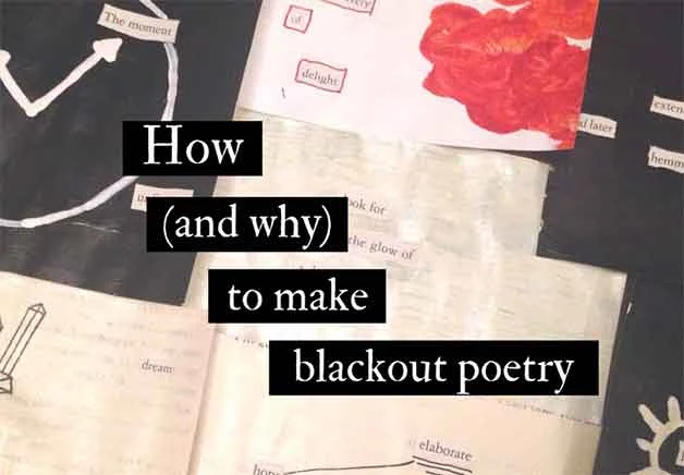
What Is And How To Creating Blackout Poetry

What Is And How To Creating Blackout Poetry

Discover the enchanting world of "Blackout Poetry," where words intertwine with art. Erasing the mundane, this form of expression transforms existing texts into captivating poems, leaving the reader entranced by the amalgamation of language and visual aesthetics. What is blackout poetry and how to create it?. Unleash your creativity and find out!.

What Is Blackout Poetry?

What Is Blackout Poetry

Blackout poetry, also known as erasure poetry, is a unique form of poetic expression that involves creating poetry by selectively blacking out or erasing words from an existing text, usually a printed page from a book, newspaper, magazine, or any written material. The words that remain visible after the erasure form the poem.

The process of creating blackout poetry involves finding interesting combinations of words or phrases within the original text and using the surrounding context to give them new meaning. By selectively obscuring or eliminating certain words, the poet creates a visually striking composition that is also a work of literary art.

The result is often a minimalist and thought-provoking poem that can evoke emotions, spark imagination, or convey a particular message. The visual aspect of blackout poetry adds to its appeal, as the remaining words stand out against the blacked-out background, making the poem visually intriguing.

Blackout poetry gained popularity as a form of creative expression and has found its way into various art forms, including social media posts, illustrations, and even book art. It allows poets to engage with existing texts in a unique way, giving new life to words that might have otherwise been overlooked or forgotten. It's a medium that encourages experimentation and challenges the traditional notions of poetry creation.

Famous Blackout Poems Examples

There were several famous blackout poems and poets who gained recognition for their work in this unique form of expression. Here are some notable examples:

1. "Newspaper Blackout" by Austin Kleon

Austin Kleon is a well-known artist, author, and speaker who popularized the concept of blackout poetry. His book "Newspaper Blackout" features a collection of blackout poems created from newspaper articles.

2. "A Humument" by Tom Phillips

Tom Phillips is an English artist and writer who worked on a project titled "A Humument." He took an obscure Victorian novel called "A Human Document" by W.H. Mallock and transformed each page into a visually stunning and poetic artwork.

3. "Redacted Poems" by Jennifer Pignolet

Jennifer Pignolet, a journalist and poet, created a series of redacted poems from news articles to explore themes of trauma, violence, and social issues.

4. "Unoriginal Genius" by Marianne Mispelaƫre

Marianne Mispelaƫre is a visual poet known for her inventive and thought-provoking blackout poetry, which often challenges conventional language and meaning.

5. "Blackout Poems" by John Carroll

John Carroll is an artist and poet who uses blackout poetry to create vivid and striking compositions that invite readers to engage with the underlying texts in new ways.

Please note that the world of blackout poetry is continually evolving, and there may be newer and emerging poets or collections beyond my last update.

We recommend exploring various online platforms, art galleries, and poetry publications to discover more contemporary blackout poets and their work.

How to Create Blackout Poetry?

Creating blackout poems can be a fun and rewarding creative process. Here's a step-by-step guide on how to make your own blackout poems:

Materials you'll need:

  • A printed page from a book, newspaper, magazine, or any written material.
  • A dark marker or pen (black is the most common choice, but you can experiment with other colors if you prefer).

Step-by-step process to Create Blackout Poetry:

  1. Choose the source text: Find a page of text that you would like to work with. It could be from an old book, a newspaper, a magazine article, or any other written material. You can select a page randomly or choose one that speaks to you thematically.
  2. Read the text: Take some time to read the entire page carefully. Try to understand the context and meaning of the text.
  3. Identify words or phrases: Start scanning the page for interesting words, phrases, or sentences that catch your attention or resonate with you emotionally. These will be the building blocks of your blackout poem.
  4. Mark the chosen words: Once you've identified the words or phrases you want to include in your poem, use the dark marker or pen to completely black out or cover the rest of the text on the page. This will leave only the selected words visible.
  5. Create the poem: Rearrange the chosen words into a poem-like structure. You can leave them in their original order or rearrange them to create a new narrative or meaning. Experiment with different arrangements to see what works best for your poem.
  6. Enhance the visual aspect (optional): If you wish to add an artistic touch to your blackout poem, you can experiment with different designs, doodles, or illustrations around the selected words. This can make your blackout poem even more visually appealing.
  7. Reflect on the final poem: Take a moment to reflect on the message or emotion conveyed by your blackout poem. The beauty of blackout poetry is that it allows for interpretation and encourages readers to engage with the work in their unique way.
  8. Share your work: Once you've completed your blackout poem, consider sharing it with others. You can take a photo of your creation and post it on social media, share it with friends and family, or even submit it to poetry communities or contests.
blackout poetry is about creative expression and experimentation. There are no strict rules, so feel free to explore, have fun, and let your imagination guide you in the process.

We hope you enjoyed this article "What Is And How To Creating Blackout Poetry", Now, you can start to improve that and follow your imagination to creating blackout poetry. Don't forget to share this. Happy blackout poem creation!.