The Power of Negative Space in Graphic Design
guides ideas inspiration learn white-space
Negative space is a powerful tool in graphic design, allowing designers to create a dynamic visual with minimal elements. It can create balance in a design, draw attention to a specific element, and can even be used to create powerful statements. In this blog post, we'll explore how negative space can be used in graphic design to create stunning visuals and how it can be used to enhance the message of any design.
Exploring the Power of Negative Space in Graphic Design
Aspiring graphic designers and art students, get ready to explore a fascinating aspect of design that often goes unnoticed but holds immense creative potential – the power of negative space. In this article, we will delve into the world of negative space in graphic design, discovering its importance, impact, and how it can elevate your design work to new heights. So, let's begin our journey into the realm of whitespace and emptiness that holds the key to visual brilliance!
Understanding Negative Space in Design
Negative space, also known as whitespace, refers to the area around and between the main elements of a design. It may appear as a void or a space, but it is far from being insignificant. Negative space plays a pivotal role in achieving balance, clarity, and emphasis in a design. When used effectively, it can create a harmonious composition that draws the viewer's attention and conveys a powerful message.

Negative space is an important part of graphic design that is often overlooked. It can be used to create a sense of balance, harmony, and emphasis in a design. By using negative space, designers can focus the viewer's attention on specific elements and messages, and draw attention away from elements that are not as important. When used effectively, negative space can help create a unified and powerful composition.
When it comes to SEO, it is important to understand how to use negative space. Strategically placed negative space can help ensure that important elements are seen by search engine crawlers, making it easier for them to index your website. Additionally, it can help draw the viewer's attention to your website's content, which can help improve your website's ranking in search engine results.

Negative space is a powerful tool for graphic designers and SEO professionals alike. By understanding how to use negative space effectively, you can create beautiful designs that draw attention and improve your website's search engine rankings.
The Art of Visual Composition
One of the fundamental principles of graphic design is achieving a balanced and visually appealing composition. Negative space is a powerful tool in this regard. By strategically incorporating empty spaces, designers can guide the viewer's gaze, emphasize focal points, and ensure that the design communicates its intended message.
In poster design, for instance, using negative space wisely can direct the viewer's attention to the main subject while providing breathing room for the surrounding elements. The result is a captivating design that effectively conveys the message without overwhelming the audience.
Embracing Minimalism: Less is More
The minimalist approach in graphic design embraces the concept of "less is more." By removing unnecessary elements and letting negative space take center stage, designers can create sleek and elegant designs that exude sophistication. Minimalist designs are not only aesthetically pleasing but also serve as a breath of fresh air in today's cluttered visual landscape.
Apple's branding is an excellent example of minimalist design. Their clean and simple use of negative space showcases their products' elegance and user-friendliness, leaving a lasting impression on customers.
Think of a simplistic yet impactful logo, like the FedEx logo, where the negative space between the "E" and the "x" forms an arrow, symbolizing speed and efficiency. Such clever use of negative space not only showcases the designer's ingenuity but also makes the logo unforgettable.
Whitespace in Typography: Let the Text Breathe
Typography is an integral part of graphic design, and negative space plays a crucial role in typography design. By giving ample breathing room to letters and words, designers can improve readability and make the text more engaging. Whitespace around headings, subheadings, and paragraphs not only enhances the visual appeal but also makes the content easier to digest.
A well-designed book cover with carefully considered typography can use negative space to draw attention to the title and author's name, creating an aesthetically pleasing cover that invites readers to explore its contents.
The Psychological Impact of Whitespace
Whitespace isn't just about aesthetics; it also has a psychological impact on the viewer. We'll explore the concept of "restful alertness" – a state where negative space allows the viewer's mind to rest while staying actively engaged with the design. Understanding this psychological aspect can help students create designs that leave a lasting impression on their audience.
Negative space in graphic design can provide a powerful psychological impact on viewers. Through the concept of "restful alertness", white space allows viewers to remain actively engaged with the design, yet at the same time provide a restful environment for the mind.
By incorporating negative space into graphic design, students can create a powerful impact on their audience with a lasting impression. Using the right amount of whitespace can help to create a visually appealing design while also providing balance and clarity.
By using whitespace strategically, designer can create a design that conveys the intended message while also sending a subtle psychological message to the viewer.
For instance, an advertisement for a relaxation spa can utilize negative space to evoke a sense of tranquility and calmness, appealing to the target audience's desire for peace and serenity.
Negative Space in Logo Design
Logos are the face of a brand, and they need to make a strong statement. Negative space can be ingeniously used in logo design to convey multiple meanings or hidden symbols, making the logo more memorable and thought-provoking. We'll analyze some famous logos that masterfully use negative space and discuss the techniques employed.

The World Wildlife Fund (WWF) logo is an iconic example of negative space in logo design. The panda's face, created through the clever use of whitespace, represents the organization's mission to protect endangered species. This design not only speaks volumes about the brand's cause but also leaves a lasting impression on the viewers.
Balancing Functionality and Aesthetics
Graphic design is not just about creating beautiful visuals; it must also serve a functional purpose. We'll explore how negative space can enhance user experience in web design, mobile applications, and printed materials. Finding the right balance between aesthetics and functionality is essential for effective design.

In web design, negative space can help reduce visual clutter and make website navigation more intuitive. By strategically using whitespace, designers can create a seamless user experience that keeps visitors engaged and encourages them to explore further.
Learning from the Masters
Throughout the history of art and graphic design, numerous masters have skillfully utilized negative space in their works. We'll take a glimpse into the works of legendary designers and artists who have left a mark on the world through their creative use of whitespace.
One of the most influential graphic designers of all time, Paul Rand, was a master of negative space. His design of the iconic IBM logo in the 1960s was an example of the effective use of white space in a minimalist logo.

Negative space, or white space, is an essential part of graphic design and has been appreciated by designers for centuries. By utilizing the negative space to separate the letters of the logo, Rand created a powerful and memorable logo that remains relevant today.
Negative space can be used to emphasize a specific design element and create a visual balance within a design. It can also be used to create a sense of movement and depth, which can be especially helpful when designing logos and other branding materials. Learning from the masters like Paul Rand can help designers understand how to effectively incorporate negative space into their designs.
Similarly, the Swiss designer Josef Müller-Brockmann is renowned for his grid-based designs and use of negative space. Müller-Brockmann's work was incredibly influential on the design world and remains so today. By using grids and negative space, Müller-Brockmann created a sense of order and unity in his designs that was both aesthetically pleasing and effective in communicating his message.

He pioneered the use of modern typography and the two-dimensional plane, and his use of negative space is perhaps his most famous contribution - one that is still used in countless designs today. His work has been an important influence on the development of graphic design and continues to inspire and inform web and graphic designers alike.
The Bauhaus movement, which was led by artists such as Walter Gropius, Wassily Kandinsky, and László Moholy-Nagy, also explored the concept of negative space in its works. The Bauhaus movement's exploration of negative space was extremely influential on future generations of graphic art.

The works of the great masters of the Bauhaus movement, such as Walter Gropius, Wassily Kandinsky, and László Moholy-Nagy, showed that negative space could be used to create powerful and meaningful effects. The movement's use of negative space was a key factor in the development of modern graphic design, and its influence can still be seen in contemporary graphic art.
Through their exploration of negative space, the Bauhaus masters showed the world just how powerful and versatile this concept could be.
In photography, the works of Ansel Adams and Henri Cartier-Bresson are renowned for their use of negative space to create compelling compositions. Negative space is a powerful tool for graphic designers as well, allowing them to add visual interest and storytelling to their designs.
Good use of negative space can draw the eye to certain elements, creating a more powerful visual narrative. When used correctly, it can add depth and dimension to a design, and help to create a more harmonious composition.

It can also be a great way to create balance and create a sense of unity between elements. Learning from the masters of photography can be a great way to understand the fundamentals of using negative space in graphic design. By studying the works of Ansel Adams and Henri Cartier-Bresson, designers can get a better understanding of how to use negative space in their designs to create impactful and memorable compositions.
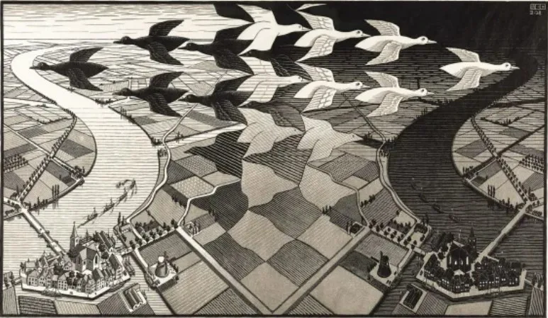
The works of M.C. Escher, the renowned Dutch artist, often feature mind-boggling optical illusions created by manipulating positive and negative space. His intricate designs challenge the viewer's perception and demonstrate the immense power of negative space to create mesmerizing visual effects.

M.C. Escher's masterful use of negative space has been an inspiration for graphic designers for decades. By exploiting the power of negative space, Escher created some of the most iconic works of art of the 20th century.

For designers, understanding the power of negative space is essential for creating visually stunning designs. Negative space can be used to create balance, to draw attention to a certain element, or to create a sense of depth. By using negative space effectively, designers can create stunning visuals that capture the eye and create a lasting impression.
These masters have all left an indelible mark on the world of art and graphic design and their works are still studied by aspiring artists today.
Putting Theory into Practice: Tips and Tutorials
For art students and aspiring graphic designers, putting theoretical knowledge into practice is vital for growth. We'll provide step-by-step tutorials and practical tips for incorporating negative space into various design projects. Whether you're working on a logo, poster, or web layout, these hands-on lessons will help you master the art of negative space in your designs.
Conclusion
As we conclude our exploration of the power of negative space in graphic design, we hope that you've gained a deeper appreciation for this often-overlooked aspect of design. Negative space is not merely an absence of elements; it is a dynamic tool that can transform your designs and elevate them to the next level.
By understanding the significance of whitespace, embracing minimalism, and learning from the masters, you can harness the power of negative space to create designs that captivate, communicate, and inspire. So, go forth, experiment, and let the power of negative space unlock your full creative potential! With diligent practice and a keen eye, you'll soon be wielding negative space like a master, breathing life and meaning into your designs, leaving an indelible mark in the world of graphic design.

